
Mapping Citi Bike routes
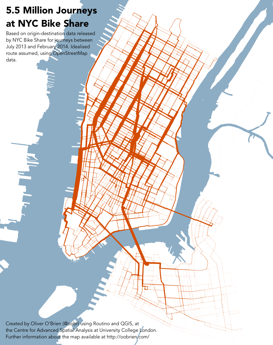
09/14/2016Back in March 2014 New York City's bikeshare system, Citi Bike, publicly released data on trips taken using their bikes. It didn't take long for mappers to get their hands on it; a really beautiful-looking geographic volume plot (geographic Sankey diagram?) came out just a couple of months later, depicting street routes taken by Citi Bikes in the city by volume. The map was made by Oliver O'Brien, a researcher at University College London.
Unfortunately Citi Bike has been through a major expansion since then, and this data is now out of date.
Here's an updated current version:

Data is the same used for my Life of CitiBike project, technically two orders of magnitude fewer trips, but still more than good enough. The most important caveat is the same: this map uses idealized routes generated by the Google Maps API, which may differ from the actual, perhaps more circuitous routes bikers take.
Try bringing up the old map and the new one and comparing the two. You may notice that there are some significant differences!
Sadly this map, too, is already technically inaccurate—another major CitiBike station expansion began this August.