
The making of Life of Citi Bike
08/27/2016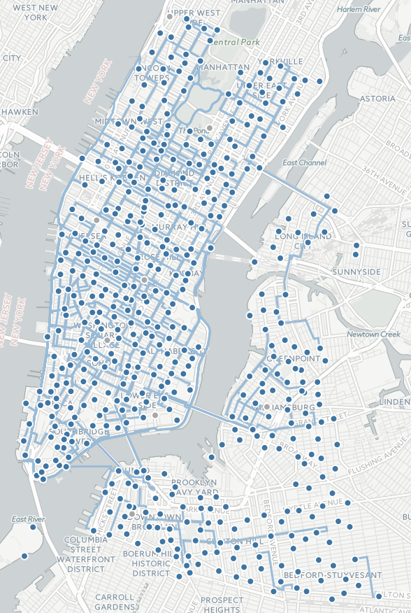
I just released the beta version of the CitiBike visualization I have been working on. You can check it out here. Since this is the largest such project I've had the pleasure of building thus far, I decided it'd be interest to write up what I learned for future reference here. If you're interested in data visualization tech and/or design, keep reading!
Inspiration
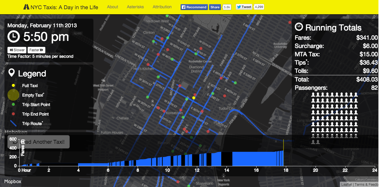
I'm a long-time regular of the r/NYC and r/datavisualization communities on Reddit, and so I took note when, in 2014, NYC tech aficionado Chris Whong published his terrific visualization of taxi cab movement in New York City, appropriately enough titled "NYC Taxis: A Day in the Life". The viz went viral on the web, making Whong a bit of a star in the nascent NYC civic tech community and winning awards and fivethirtyeight interviews along the way.
This was way before I even knew what "civic tech" was (if you're not sure either, check out some of the examples on the highly recommendable Data-Smart City blog). But of all of the visualizations I've ever seen on Reddit, I can confidently say that this one that's stuck with me the best. Go figure.
CitiBike has been around for a while now, and its data has been too, but it wasn't until literally years later, around February this year, that I discovered that said data is totally publically available. And I got to thinking: can I do a taxicab thing, but with Citi Bikes?
Chris Whong put up a series of technical
posts explaining his work (which this post is itself inspired by, along with Eevee's blog), and I poured through them. I had a modicum of D3.JS experience at that point, so I even got as far as mocking up a moving
blob-thing. But in the end I got lost somewhere in the JavaScript, and I had to leave the idea aside for another
day.
A half a year, oodles of code, and most of an internship later, I got thinking about the idea again. The catalyst
was my discovery of Leaflet.D3SvgOverlay, a niftly little plug-in that purported to handle all of
the daunting coordinate-to-pixel binding bits for me. And so off I was to the races!
Design Considerations
The structural differences between CitiBikes and taxis made that that frame of reference altogether inconvenient, and mapping CitiBikes requires solving a slightly different set of problems than mapping taxis.
First of all, in the city that never sleeps taxis truly are 24-hour affairs, and you can rely on one zipping around at all hours of the day (mostly—if you watch enough taxi viz loops, you'll see that this has occasional foibles). Meanwhile, think back to the last time you saw a bike on a 4 AM streets. I would wager most haven't. If I were to copy the taxi viz and model my simulation around a single bike-day, it would be deathly boring at night.
Second of all, taxis zip around literally. If they're not driving a passenger, they're just driving, so the vehicle is always in motion, and probably full just about as often as it is empty. CitiBikes, by contrast, spent the vast majority of their day in their docks, doing precisely zero miles per hour. What makes the taxi viz appealing is that its simulacra never stop moving—a textualist interpretation of the philosophy of the ever-moving city. A lone CitiBike, by contrast, spends 90 to 99 percent of its time stationary.
On the other hand, CitiBikes have some advantages t0o. A taxi can go anywhere its four wheel can take it, and they can take it pretty far—some particularly well-compensated taxi trips start in midtown Manhattan and end on the tip of Long Island. To deal with this, the taxi cab viz pins the user on top of the cab: you can zoom in and out, but the cab remains in the center of the screen. CitiBikes, which inevitably move to and fro between well-defined stations, have no such problem; I am free to release the user to wander in whatever bit of the city they find interesting.
I ultimately realized that CitiBike stations are far more interesting than individual bikes. My end product is called "Day in the Life of CitiBike" the system—the giant Markov chain of endless transitionally probabilistic commuter possibilities (seriously, mathematicians love this stuff). And the visualization would have two modes, I decided. One would be a direct interpretation of bikes moving to and from stations over the course of a busy day (the fancy word is "transition matrix"). The other would visualize where those bikes do end up going throughout the day, by tracking bikes from one particular station or set of stations to their midnight termini.
Surveying the Data

Trip-level CitiBike data is distributed as monthly snapshots in an Amazon S3 Instance. After fiddling around with these a bit I downloaded the June 2016 one and, finding that June 22 was the busiest day on record for CitiBike (though perhaps August has beat it now?), partitioned out trips from that day as points of interest.
Right off the bat, this data required some thinking. First of all, CitiBike is not strictly a Manhattan-and-parts-of-Brooklyn affair—a significant chunk of stations actually also exist in Jersey City. If you pay attention to my visualization, though, you'll notice that I leave these out. Why? Because the CitiBike data doesn't include these stations at all!
This simplified things for me a bit, making my view a little more balanced and easier to center. But I can't help but be kind of miffed. There is no good reason, except for administrivia, for this being the case. Nor was this fact mentioned anywhere.
Ok, so we'll do the New Yorker thing and ignore New Jersey. But there's another set of data not in the dataset, too. When you get a bunch of people to ride bikes around from place to place, over time (not even that long) they'll tend to accumulate them in certain places at certain times of day and leave other areas floating high and dry. After all, no one says you have to ride a CitiBike back the way you came, and bye and bye they generally don't.
Bikes have to get rebalanced from time to time: moved from popular stations to less popular ones and vice versa, as the time of day requires. Generally this is done by van. It's an expensive operation that has been a big part of why the (unique in the world of commuter biking, unsubsidized) CitiBike system has historically been a loss-making operation.
The CitiBike trip dataset includes information on user trips, but it says nothing on rebalancing trips. Because of the granularity of the data, thankfully, we can reconstruct these: just check out cases where a bike trip ends one trip at one station and then seemingly "teleports" to another one at the beginning of its next trip. Unlike with user trips, we don't know when these trips actually happen, but we can make educated guesses about that.
Finally, I needed to make allowances for "special" stations. Broadly, there are two kinds. The first are inactive
stations: stations which purport to be active, and ought to be, yet have no trips to or from them, evidently
because they are out that day for maintenance. In the final visualization these would need to be treated as a
special case. The second group are depots: repair stations, essentially. I weighed keeping these in, but a couple
of these are way outside of the rest of the system (one has (0, 0)
coordinates—worse than nothing!) and would mess up the view so I decided to drop them.
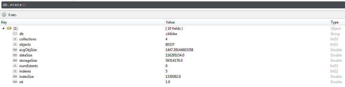
Building the Database
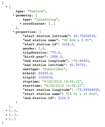
The paths displayed by the CitiBike viz are actually all merely convenient lies. The CitiBike dataset, just like the taxicab one, does not provide any geography for its trips. We are only given a starting point and an ending point; it's up to us to determine the in between.
To do this, I used the Google Maps
Directions API. Theoretically speaking, I would take take each trip, feed its starting and ending coordinates
through the directions API (in bicycle
mode), and extract the coordinates. For efficiency, Google doesn't actually return a list of coordinates: it
returns a compressed and encoded format known as a polyline, which you
can then decode yourself in your favorite programming language (I used the eponymous polyline Python package). I'd
then attach these coordinates to the trip properties present in my dataset and store the result somewhere.
This required spinning up a database. MongoDB does the job. Now, the
Google API rate limits use to 2500 requests per day. Although that's a lot, it's still not the 50000+ June 22
CitiBike trips, and so, since I couldn't run everything through the API all at once, I had to track which
trips from the master dataset were and weren't already in my data store. To do this I created a citibike-trip-ids collection whose only contents was a list of trip ids in the database. When I ran my processing job I would randomly select
new trips to process from the set difference of ids from the master list and ids from the database list. Once no
difference remained, there wasn't anything more to process.
Storing a unique coordinate list for every trip is terribly inefficient. Stations tend to send bikes to other stations which are reasonably popular destinations reasonably close to them; furthermore, every coordinate list actually encodes both the trip from A to B and, when read backwards, the one from B to A. If we take advantage of these two facts and recycle pre-existing trip information, we slim down both the database we're building by almost an order of magnitude.
My database does this by decoupling trips and their geometries. Coordinate lists are stored in a trip-geometries collection, which documents both coordinate lists and the start
and end stations (by ID) associated with them. When I read new trips into the database, I check whether or not
those endpoints (in either order) already exist in my list. If they do, I just insert the trip into my citibike-trips list and keep going. If they don't, then I query the API,
retrieve and extract a coordinate list, and store that in trip-geometries,
before finally inserting the trip itself into my list.
This meant that the further I got into feeding trips into my database, the lower and lower the percentage of trips I would need to create new geometries for. For the last set of ~20000 trips that I ran this worked out to a ~75% "compression ratio". Put another way, I was inserting 10000 trips for the price of 2500 queries!
There are a couple of caveats. The first is that rebalancing trips aren't bicycle trips at all: they (mostly?) take
place in the back of a van. Every time I processed a rebalancing trip, instead of running the associative check
above I would run that trip through the API (in driving mode!) and embed those coordinates directly in citibike-trips itself. In retrospect, this was foolish: it added significantly to
overall complexity, with only a very small benefit to imagined accuracy. But what's done is done.
The second caveat are trips that Google doesn't understand. There are more trips to and from the two Governer's Island stations than there are between them. These bike rides weren't just bike rides, they were bike-and-ferry rides, but Google doesn't know that; it thinks you're trying to ride a bike across the Hudson, and it will have none of it. I simply dropped the ball the dozen or so times this happened, as these outliers were not very important.
Building the API
The core database layer I've created is purposefully very generic: it just implements an efficient strategy for storing a bunch of trip data, Turning that data around into something useful is the job of the API.
To return a single trip, my API does what I did to feed trips into the database, backwards: I request a trip id from the database, grab its start and end station ids, request the associated geometry from the database (reversing it if need be), embed those coordinates in the response, and return that.
I'm not interested in solitary trips, however, I'm interested in sets of them. For this we use two different
abstractions. outgoing-trips and
incoming-trips are sets of bike routes which leave from or arrive at, respectively, specific station of
interest. bike-outbounds and bike-inbounds, by
contrast, a sets of bike routes corresponding with bikes that began the day or ended the day,
respectively, at the station in question.
To return these packagings efficiently I created a separate collection, station-indices,
which contains lists of trip ids for each of these groups, per-station. At runtime the API takes
a station id, queries station-indices for it, extracts the list of interest from
that result, loops through the individual trips of interest using the single-trip extraction process, packages
the result, and returns that.
These requests are routed through simple GET requests against the citibike-api subdomain on my personal website (what you're reading now). I emit
the data in JSON format. Here's an example result.
Generating Metadata
That concludes the backend. I've stuck so far to giving a moderately high-level conceptual overview, without the nitty-gritty details of what the code actually looks like.
The entire backend, sans the database itself, is up publically in the citibike repository on my GitHub. The first item
of interest is the notebooks folder. This contains a series of Jupyter notebooks, ordered by number. Notebooks 1
through 5 are scoping-out code and were the first thing I did for this project; they work out some of the finer
details of the dataset on a few examples and gave me some idea, at the beginning of this project, what it would
look like once complete.
The sixth notebook there munges the June 2016 CitiBike dataset and builds the finalized raw dataset used as a raw
input by the rest of the visualization. It uses a reusable Python module that I wrote for the backend, called citibike_trips, to do some format conversions and, most importantly, plug
rebalancing trips into the dataset. If you know your way around Python pandas
functions, this should be quite readable.
Notebooks seven, eight, and nine, run in sequence, build metadata about individual stations in the
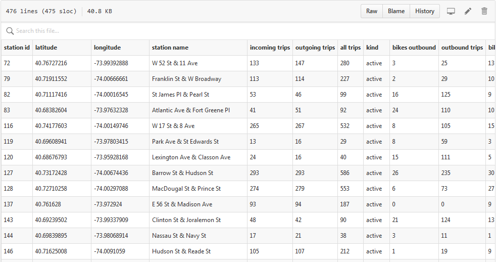
CitiBike system, generating june_22_station_metadata.csv. This file contains
metadata about all 475 stations in the CitiBike system that made the final cut; it's used by the front-end to
plot and display information about these stations on my map.
Notebook ten just contains some checks that make sure everything is neat.
Finally, the last notebook, number eleven, contains the code that generates the aforementioned station-indices collection within the database.
Most of the heavy lifting throughout is handled by the ~500 line
citibike_trips module, and I use a relatively simple data_chunker
command line utility to incrementally feed the database. Here's a shot of it in action:

Gotchas So Far
There are a couple of gotchas that are worth pointing out.
There's the matter of
pymongo, the Python driver of choice for MongoDB operations. It's...not very Pythonic. It doesn't work
with numpy datatypes, despite their ubiquity and convenience, requiring some
ugly workaround type-patching:
    attributes = {
        "tripduration": int(time_estimate_mins * 60),
        "start station id": int(start_point['end station id']),
        "end station id": int(end_point['start station id']),
        "start station name": start_point['end station name'],
        "end station name": end_point['start station name'],
        "bikeid": int(start_point["bikeid"]),
        "usertype": "Rebalancing",
        "birth year": 0,
        "gender": 3,
        "start station latitude": float(start_lat),
        "start station longitude": float(start_long),
        "end station latitude": float(end_lat),
        "end station longitude": float(end_long),
        "starttime": rebalancing_start_time.strftime("%m/%d/%Y %H:%M:%S").lstrip('0'),
        "stoptime": rebalancing_end_time.strftime("%m/%d/%Y %H:%M:%S").lstrip('0'),
        "tripid": delta.index[0]
    }
Also, in contrast to the usual Python norm, pymongo is really strongly
typed. This is a database driver, so it comes with the territory, but a gotcha that got me was that find_one({'bikeid': 1234}) and find_one({'bikeid':
'1234'}) are different datums.
The one other annoyance of note is a quirk in the way that flask, the webservice module that I use
to actually run my website, handles JSON. flask provides a native jsonify method, which, besides not working, made things doubly annoying with a
cryptic C-style error message:
    File "C:\...\flask\app.py", line 889, in call
    return self.wsgi_app(environ, start_response)
    File "C:\...\app.py", line 879, in wsgi_app
    response = self.make_response(self.handle_exception(e))
    File "C:\...\app.py", line 876, in wsgi_app
    rv = self.dispatch_request()
    File "C:\...\app.py", line 695, in dispatch_request
    return self.view_functionsrule.endpoint
    File "C:\...\web.py", line 50, in autocomplete_search
    return jsonify([{'label' : klass.name } for klass in query.all()])
    File "C:\...\helpers.py", line 106, in jsonify
    return current_app.response_class(json.dumps(dict(args, *kwargs),
    ValueError: dictionary update sequence element #0 has length 1; 2 is required
Ugh.
In an issue on the subject it's pointed out that "For security reasons only dictionaries can be returned." Flask docs point to a problem in EMCAScript 4 as the problem. The trouble is that EMCAScript 5, which fixed this vulnerability, is almost seven years old now. This got really conscientious (twice), so...yeah. At least getting around this restriction is simple, once you know what the problem is:
return Response(json.dumps(tripset), mimetype='application/json')
Now it was time to get my database off my computer and onto the Internet. I did this using an mLab instance. Getting the data onto there was actually pretty annoying, in that
usual working-with-databases way. mLab has pretty good instructions on what to do in
theory: run mongodump in the command line, then run mongorestore with a few command-line options that they provide in the DBA tools
panel. In practice I learned that whilst mongodump can run anywhere and work
(as long as your MongoDB database is on the default filepath), mongorestore
only did what I wanted it to do if run with path set to . ("here" in shell) while in the dumps folder
where MongoDB dropped the archive.
The Frontend—Technical Considerations
Which brings me, finally, to the hard part: building the visualization itself.
All of the JavaScript necessary to run the visualization is packed into one giant 1800+ line file,
which you can see for yourself
here. Although it's verbose as all hell, as D3.JS and pure JavaScript code tends to be, a lot of it is pretty prosaic. Fade this menu
in. Fade that menu out. Load this data. Colormap these points. Disable this button. On and on.
While I'm not interested in doing a line-by-line breakdown of my code, I am going to say a few words about the technical challenges and gotchas of integrating Leaflet and D3.JS together that I had to overcome in the process of building this visualization.
The entire visualization takes place over a full-screen webmap. The webmap that I use is that flagship of the web
mapping community, Leaflet.JS.
The first crucial difficulty that I faced, which I alluded to at the very beginning of this post, was that I didn't actually know how to go about binding shapes to the map in such a way that when I zoomed or panned around, the shapes would stick to the same spot on the map. Theoretically speaking, it's possible to do this by using Leaflet's own shape-rendering codes, which were built for exactly this purpose and handle all of that for you. And indeed, it may be possible for someone far more familiar with Leaflet's drawing facilities than I to replicate the work I've done purely using Leaflet functions.
But I was wary of using it because I am comfortable writing pure D3.JS visualization code, and I knew that Leaflet shapes are just a fancy
wrapper around D3 code. I didn't think that Leaflet's shape-rendering is powerful enough to achieve the effect I
wanted.
Leaflet.D3SvgOverlay is what ultimately made this project possible. I
had only a very weak idea of how one would go about doing the hard work of binding coordinates to a webmap in a
sticky and zoomable way. When I stumbled on a library that did all of that for me, suddenly that difficulty was
eradicated!
This little library provides with a nifty d3SvgOverlay callback, within which
you have access to a simple latLngToLayerPoint() method for fitting coordinates
to the map. The entire design pattern for a basic Leaflet+D3 visualization looks like this:
    // Create the basic map canvas.
    var map = L.map("map-canvas", {
        ['global map settings...']
    });

    // Fit the map to a certain area.
    map.fitBounds([[40.6794268,-73.92989109999999], [40.789747, -74.075979]]);

    // Create the tile layer.
    L.tileLayer('http://{s}.basemaps.cartocdn.com/light_all/{z}/{x}/{y}.png', {
        ['tile layer settings...']
    }).addTo(map);

    // Enable the D3 callback.
    var mapOverlay = L.d3SvgOverlay(function(sel,proj) {

        // Functions that do things once they get called by the main method.
        function doSomething() {
            ['...']
        }

        function doSomethingElse() {
            ['...']
        }

        ['...']

        // The main method---what gets executed at runtime.
        mainMethod();

    }

    // Add the D3 callback to the map.
    mapOverlay.addTo(map);
Not bad at all!
Now, this interface does have certain important technical details to keep in mind.
First of all, when the Leaflet map zooms in or out Leaflet.D3SvgOverlay
will rerun any code that's hanging out in mainMethod(). This means that if you
for instance start things off with a runIntroAnimation() method,
every time the map zoom level changes you'll run that animation all over again!
This is obviously not what we want. You can get around this by using a global flag variable placed outside
the scope of the d3SvgOverlay callback. Have your method immediately set that
flag when it is executed, and wrap the execution in an if statement to prevent
it from re-executing. This will look something like this:
    var is_intro_anim = true;

    var mapOverlay = L.d3SvgOverlay(function(sel,proj) {
        if(is_intro_anim) {
            is_intro_anim = false;
            runIntroAnimation();
        }
    }
Next, when the Leaflet map is zoomed into or out of Leaflet.D3SvgOverlay will
keep any shapes on the map not touched by a rendering algorithm at the same geographic size. This means
that you might be looking at a line that's 2 pixels wide to start with, zoom in twice, and discover that your
line is now 200 pixels wide! This is the default SVG canvas behavior for when the viewbox is changed.
Sometimes this is what you want, most of the time it isn't. If the shape you want to remain constant in size is a
path, you can use the "vector-effect": "non-scaling-stroke" CSS trick to very
easily keep that line at 2 pixels wide at all resolutions. For all other SVG shapes, though, it's up to you to
write whatever code you need to rescale the screen. You can do this by capturing the current zoom level with
map.getZoom() and applying that as a multiplier to your shapes. Here, by way of
another global variable (scale_factor), is (basically) how I did it:
    var is_intro_anim = true;
    var scale_factor = null;

    var mapOverlay = L.d3SvgOverlay(function(sel,proj) {

        function rerenderStations() {
            d3.selectAll(".station")
                    .attr({
                        "r": 5 * scale_factor,
                        "stroke-width": 2 * scale_factor
                    });

        if(is_intro_anim) {
            is_intro_anim = false;
            runIntroAnimation();
        }
        else {
            // Rescale.
            scale_factor = Math.max(1 / Math.pow(2, map.getZoom() - 13), 0.0625);
            // Correct the displays.
            rerenderStations();
        }
    }
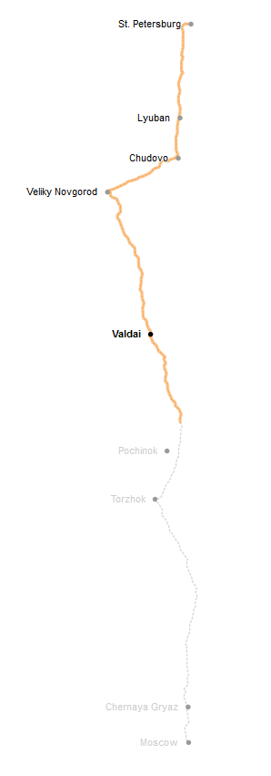
Going into the project, what I thought would be the second hardest part of the frontend part would be getting the lines I wanted to draw right. I was helped here by an oldie-but-goodie New York Times newsgraphic about the poor state of repair of Russia's main St. Petersburg—Moscow throughway and the various curios you see along the way. What's nice about this story collection is that as you read through it you're followed along the way by a nicely animated SVG path telling you where you are, both literally and physically, in the story:
It turns out that you can actually do this pretty easily by abusing the
stroke-dasharray and stroke-dashoffset
properties of a path. These properties, meant to be used to create dashed lines with filled (dasharray)
and empty (dashoffset) areas of certain sizes, can be made to build dashed lines with just two parts: a filled-in
part at the beginning and the long gap after it. Animate a transition from all-gap to all-filled and there you have
it, an animated line. Clever, really.
I ended up tearing this recent block down and using that. I had it working in no time at all. Totally anticlimactic.
Ah but wait reader! There's more! Remember the "vector-effect": "non-scaling-stroke"
trick I mentioned earlier? Since I'm by no means an SVG ninja I can't say precisely what the issue is, but
when you combine this effect with the stroke trick and actually try zooming in or out, everything becomes a
strokepocalyptic gobbly-goop.
One last technical gotcha: the core latLngToLayerPoint() method returns the
exact pixel coordinate of the geographic feature at the current zoom level&mdash, resulting in subpixel
drawing error. When you zoom in a lot—and remember, on a Leaflet map you can zoom in by a factor of 10,000 or
more—that error starts to matter:

This turned out to be a one-line fix. On line 117 the code applies a ._round()
method (actually a wrapper of a Leaflet method) to its projected_point; I
commented that out. And it was smooth sailing from there:
Conclusion
All in all, this project has (so far) taken around 1000 lines of Python code, 1800+ lines of JavaScript, a reasonably-sized MongoDB database, and the around 1000 lines of actual words that you are reading right now. All in all, it took me about a month to turn this project around.
On the design side, my experience building this visualization has reinforced my conviction that, ultimately, the interestingness of the story that you tell is as much a factor of the visual methodology that you use to do it as it is one of the interestingness of the underlying data that you use; and that it's really hard to tell if an approach you take is going to work out or not when you're just starting out on a new thing. Nevertheless, I'm satisfied with the way things turned out worked with before I did this project.
The project remains in a beta version for the moment; I plan to return to it sometime in the future, once I have more front-end experience under my belt. In the meantime, feedback welcome!
Interested in learning more about the CitiBike system? This analysis was predicated by a wealth of work done by others. Check out Todd Scheider's "A Tale of Twenty-Two Million Citi Bike Rides" for terrifically formulated insights into the nature of the Citi Bike system. See Urbica Design's write-up and visualization for deeper insight into the system's distribution and load balancing. Finally, check out the IQuantNY blog for any number of posts about the system: including one on the busiest CitiBike of them all.